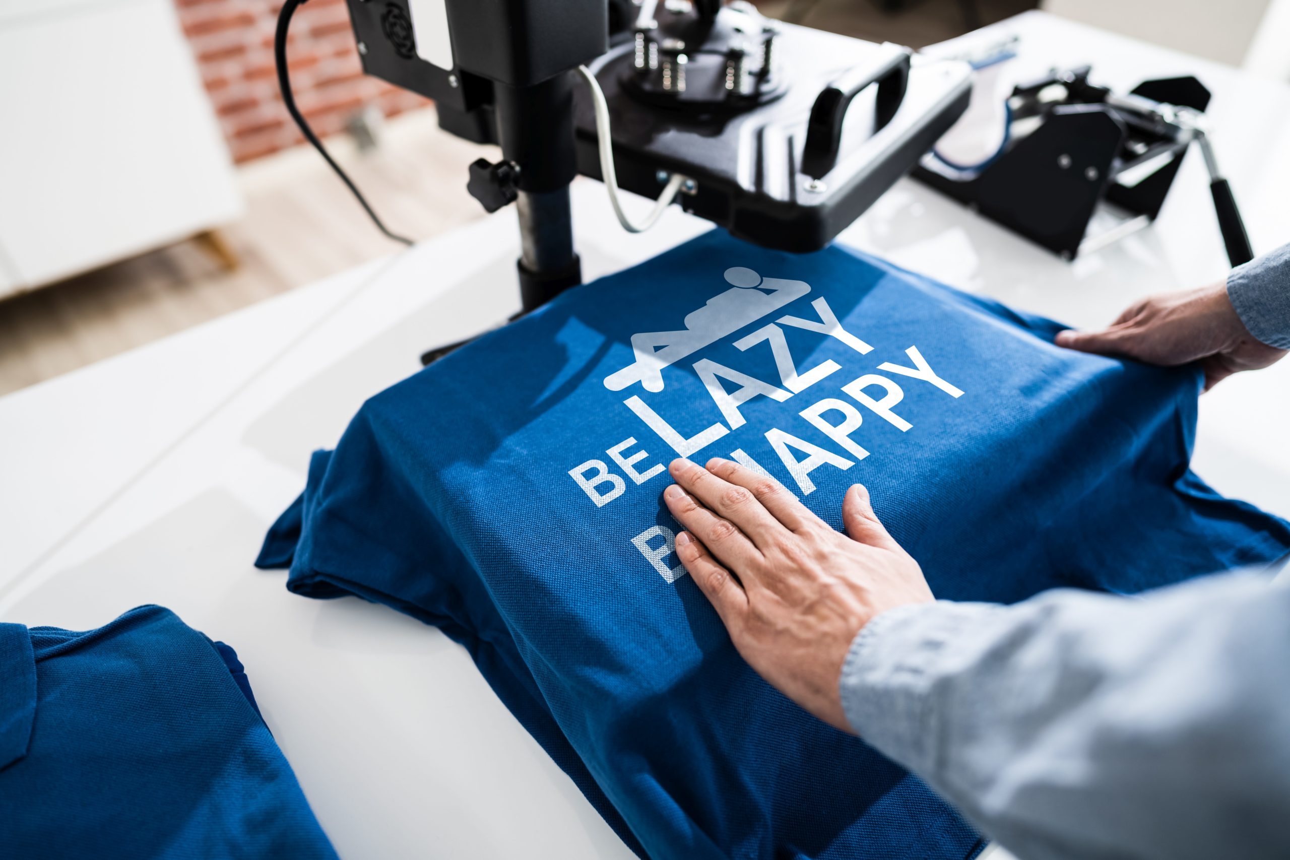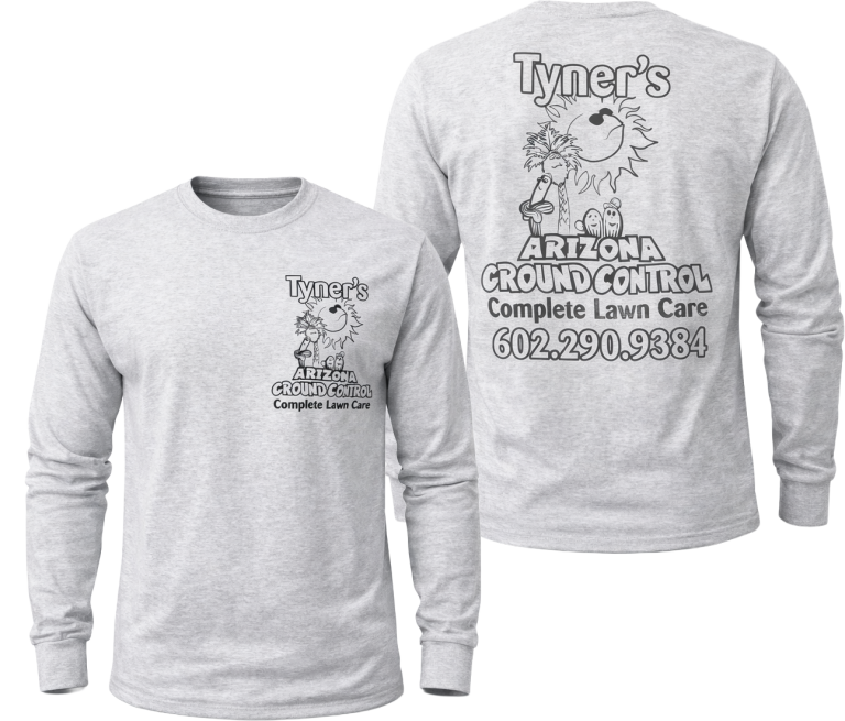
Adding multiple colors to a screen printed design can create depth, contrast, and visual interest, but there is a point where additional colors can make production more complex without necessarily improving the final result. Each color in a design generally requires separate preparation, alignment, and ink application, which means highly colorful artwork needs careful planning before it reaches the garment.
For businesses, organizations, schools, and event planners in Phoenix, AZ, understanding how color count affects screen printing can make it easier to prepare artwork that looks clear and intentional. A design does not always need fewer colors, but every color should serve a visual purpose.
Why Does Each Ink Color Matter in Screen Printing?
Screen printing is built around layers.
In many traditional applications, each ink color is applied through its own screen. The printer must prepare those screens and make sure that every color aligns correctly with the others during production.
A two-color design is generally more straightforward than an artwork file containing six, eight, or more colors. As the number of colors increases, so does the number of individual elements that need to work together.
This makes registration especially important. Registration refers to the alignment of separate color layers. If those layers shift even slightly, small gaps, overlaps, or uneven edges can become visible.
For a detailed screen printing tshirt, those differences may be more noticeable when several colors meet within a small area.
Can Too Many Colors Make a Design Look Busy?
Sometimes the issue is not technical production but visual clarity.
A logo or illustration with many closely related colors can look effective on a computer screen because digital displays can reproduce subtle gradients and variations easily. Those same differences may be less meaningful when transferred to apparel.
Too many ink colors can cause important design elements to compete with one another. Small lettering, fine outlines, and key branding details may become harder to identify when surrounded by numerous shades.
When preparing artwork for custom apparel printing, it can be useful to ask whether each color adds something necessary.
If two similar shades serve nearly the same purpose, simplifying them may make the design cleaner without changing its overall identity.
How Does Color Count Affect Artwork Separation?
Artwork separation is an important part of screen printing preparation.
A multi-color design must be separated into individual printable components so each ink can be applied correctly. The more colors included, the more complicated this preparation can become.
Detailed artwork may also contain overlapping colors, tiny accents, shading, or transitional areas that require additional consideration.
A screen print shop may review the artwork to determine whether certain visual effects can be simplified while preserving the intended appearance.
This is especially important for logos or graphics originally created for digital use. Digital artwork can include an almost unlimited number of tones, but apparel printing relies on a physical production process with different limitations and considerations.
What Happens When Colors Need Precise Alignment?
Some designs allow small amounts of spacing between colors, while others depend on precise alignment.
For example, a graphic featuring one solid color beside another may be relatively forgiving. A design with narrow outlines surrounding every letter or shape requires much tighter registration.
As additional colors are introduced, there are more opportunities for small alignment differences to become noticeable.
This does not mean complex artwork cannot be screen printed. It simply means the design needs to be evaluated according to the final print size, garment type, and level of detail.
A professional Clothing Printing Shop may recommend artwork adjustments when excessive color layers could interfere with clarity or consistency.
Does the Garment Color Affect the Number of Inks Needed?
The color of the garment can also influence how a design is prepared.
Printing colorful artwork on a light garment may involve a different approach than producing the same graphic on a dark shirt. Certain designs may require additional considerations to help brighter colors maintain their intended appearance.
This means a design that appears to contain only a few visible colors may involve more preparation depending on the garment being used.
For Phoenix organizations ordering shirts in several garment colors, it is helpful to evaluate how the artwork will work across the entire order rather than assuming the same setup will look identical on every background.
Contrast matters just as much as the number of colors.
Can Fewer Colors Sometimes Create a Stronger Design?
Yes. Simplification can often improve visual impact.
Many recognizable logos rely on a limited palette because fewer colors can make shapes, text, and symbols easier to identify quickly. The same principle can apply to screen printed apparel.
Reducing unnecessary shades may improve readability, especially when the design is viewed from several feet away.
For employee shirts, uniforms, event apparel, or branded merchandise, recognition is often more important than reproducing every subtle visual effect found in the original digital artwork.
A screen printing service may help determine which design elements should remain distinct and which colors could potentially be combined without losing the intended message.
When Are Multiple Colors Worth Keeping?
A larger color palette can still make sense when the artwork depends on it.
Illustrations, mascots, commemorative designs, and branded graphics may require several colors to maintain their character. In those situations, the goal is not to remove colors simply for the sake of reducing them.
Instead, each color should be evaluated based on its contribution to the final design.
Important questions include whether the colors create necessary contrast, whether they remain distinct at the intended print size, and whether small details can be reproduced clearly.
The best decision depends on the artwork rather than a fixed number of acceptable colors.
Color Planning Can Improve the Final Printed Result
Using many ink colors is not automatically a problem, but complex designs require more planning than simple ones. Each additional color can affect artwork separation, screen preparation, registration, contrast, and the overall clarity of the printed image.
For businesses and organizations in Phoenix, AZ, reviewing the color palette before production can help ensure that a screen printing tshirt remains readable and visually balanced.
A thoughtful design does not necessarily use the fewest possible colors. Instead, it uses the colors that are necessary to communicate the artwork effectively.
By evaluating color count alongside garment color, print size, line detail, and visual hierarchy, custom apparel printing projects can retain their intended character without allowing unnecessary complexity to overwhelm the finished design.